Malva Arquitectura
Malva is a young, independent architecture studio focused on creating value through the design of experiences that enhance the relationship between people and space. Its practice brings together architecture, management, and visualization as interconnected areas, with a portfolio of over 50 realized projects ranging from residential works to large scale developments and awarded competitions.
From a design perspective, we developed a scalable identity system built around a distinctive isotipo, conceived to support growth and the development of sub-brands while strengthening recognition through consistent application. A clear brand architecture organizes how each part connects, making the system easier to understand and implement.
Fields: Strategy, Identity, Branding, Art Direction, Editorial, Print.
Collaborators: TEG Studio (Graphic design), Nicolas Amendola (Photography).
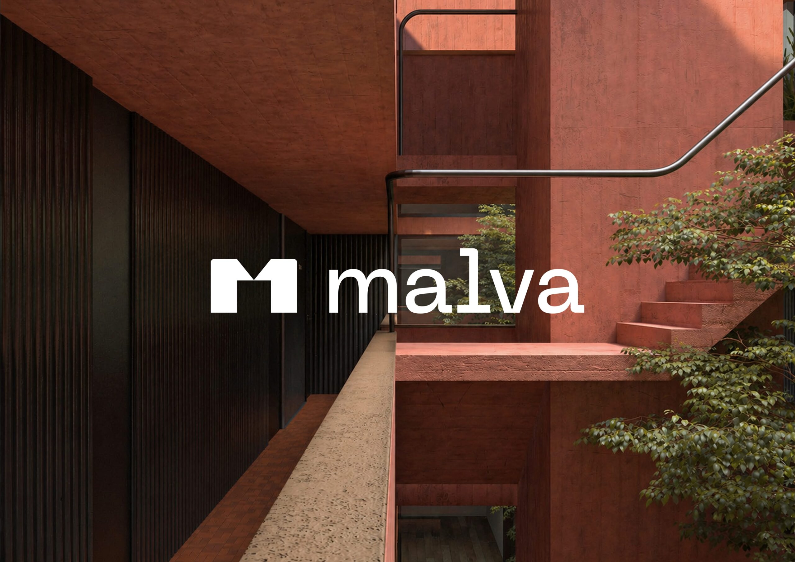
The isologo is built around a bold, geometric “M” that condenses the studio’s identity into a clear and recognizable form. Its clean cuts and defined angles are inspired by the geometry of architectural structures, echoing the lines and intersections found in built space.
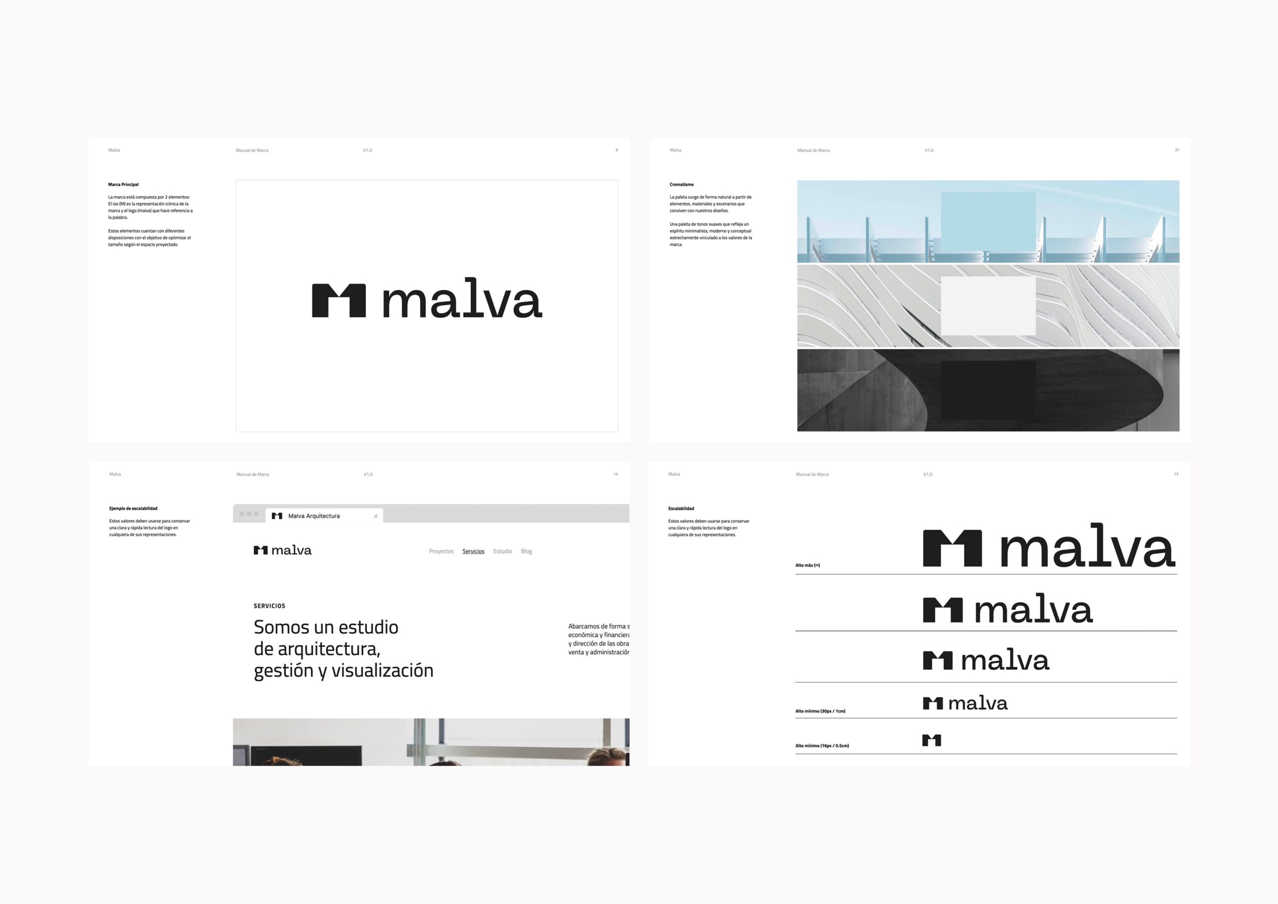
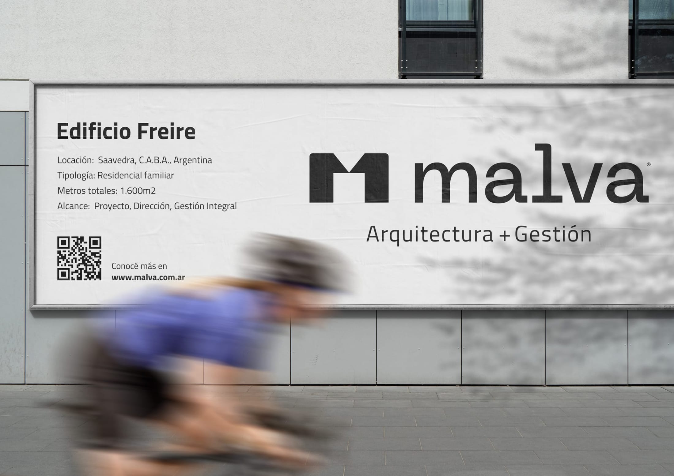
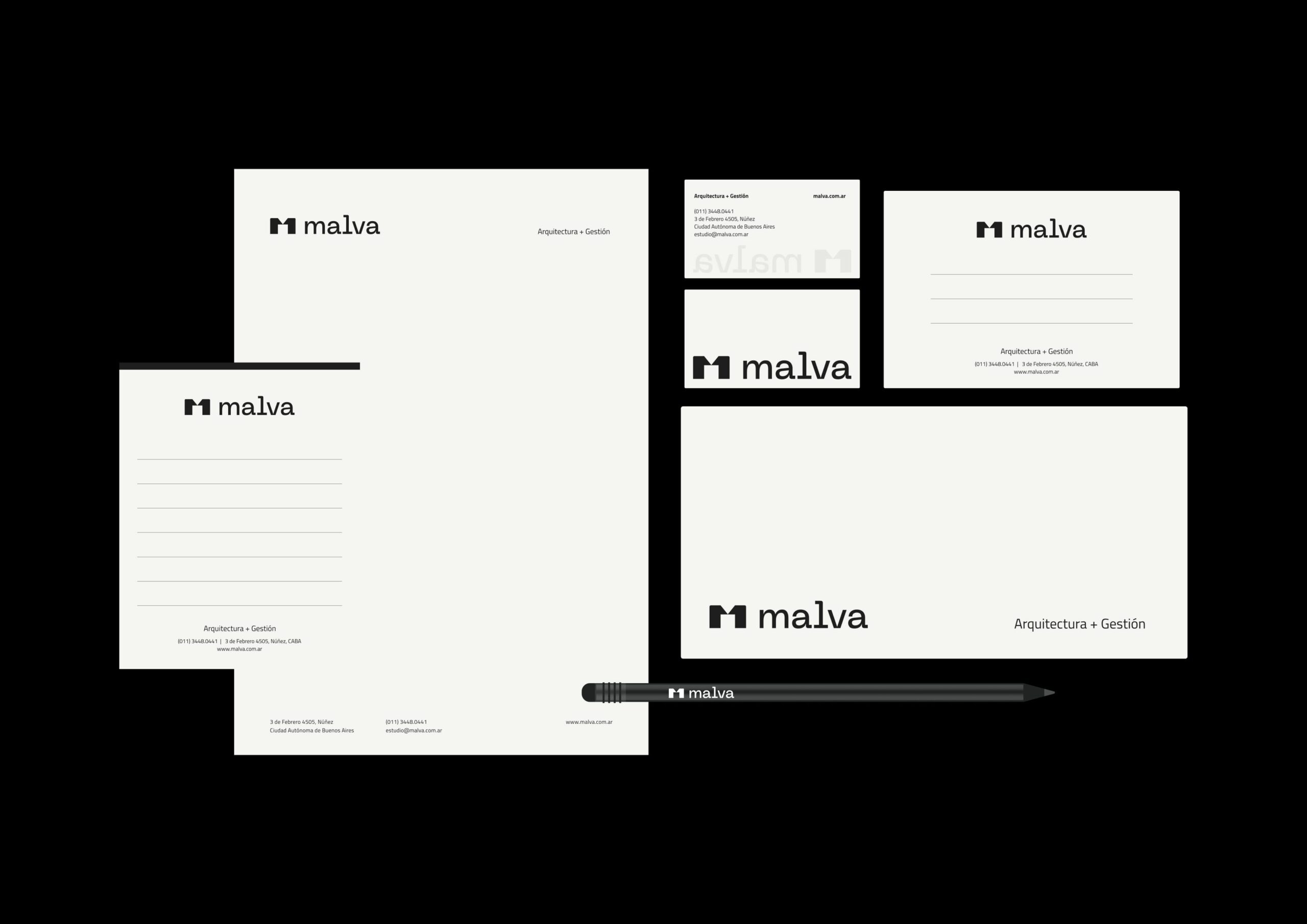
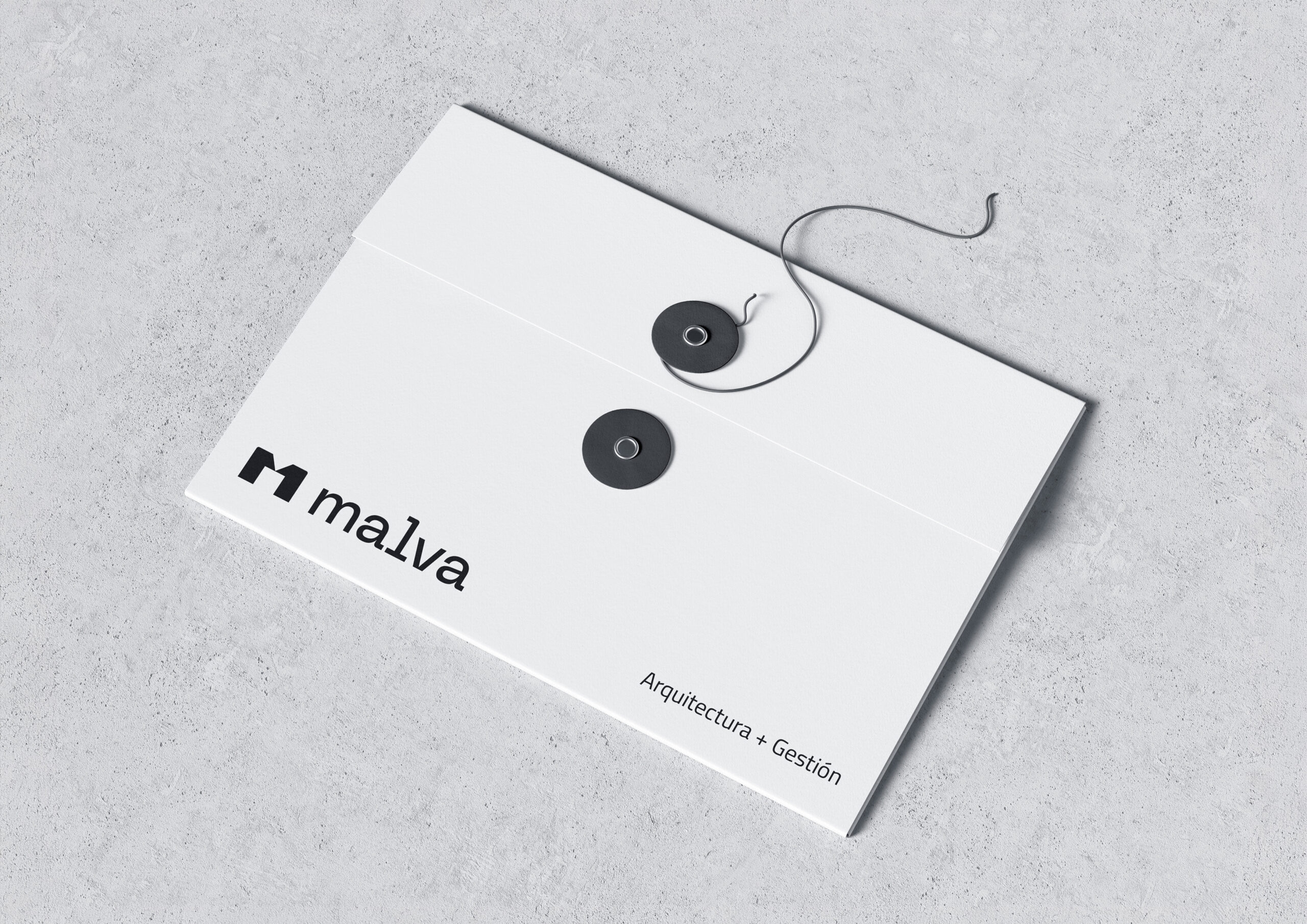
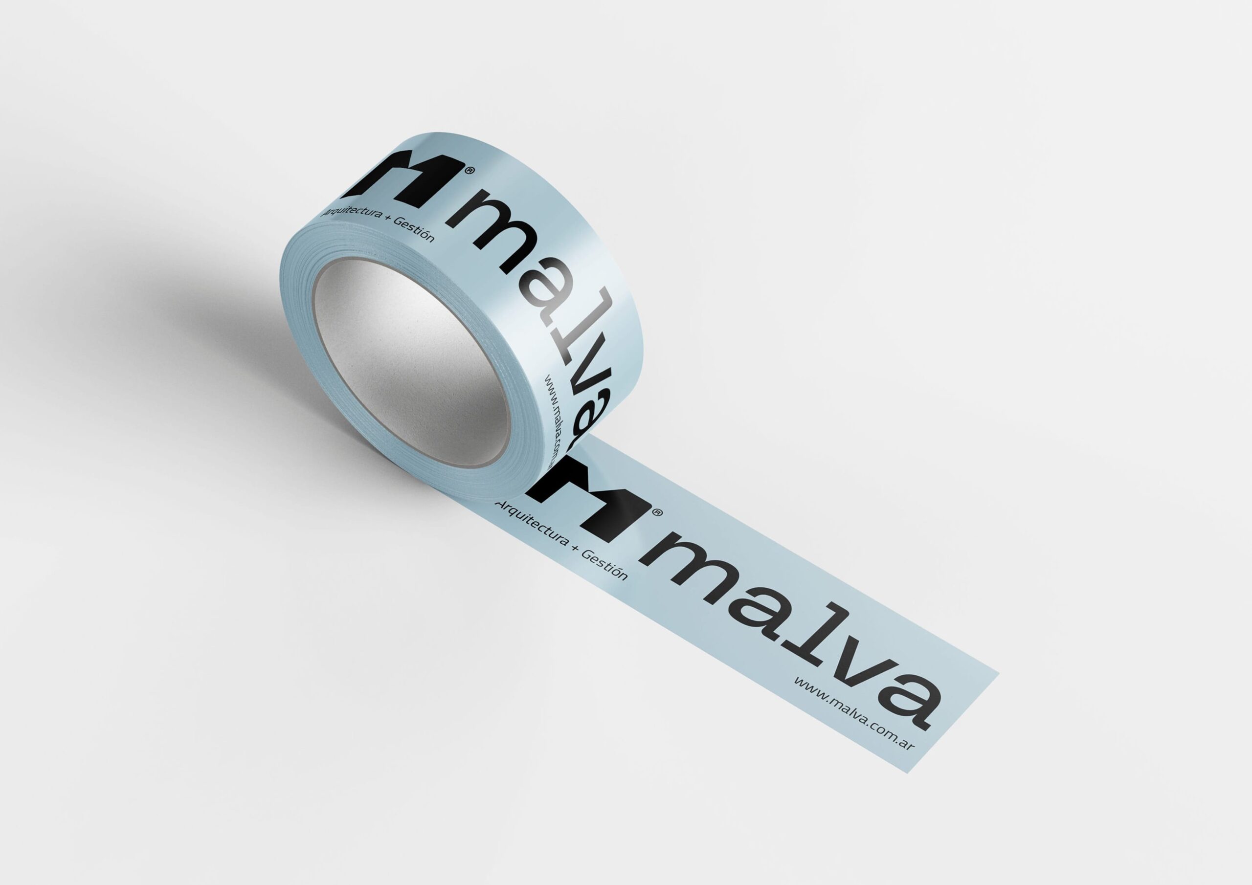
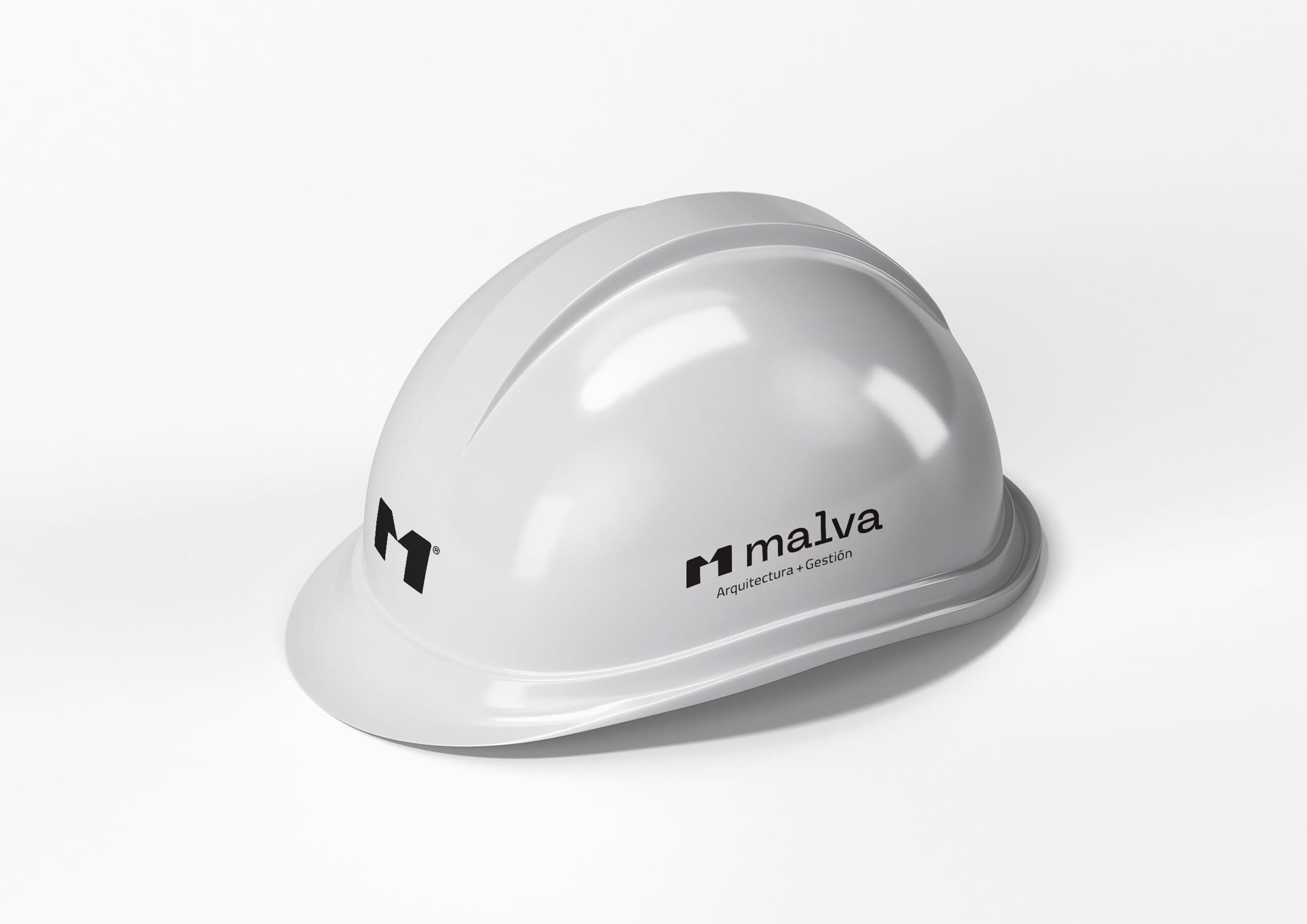
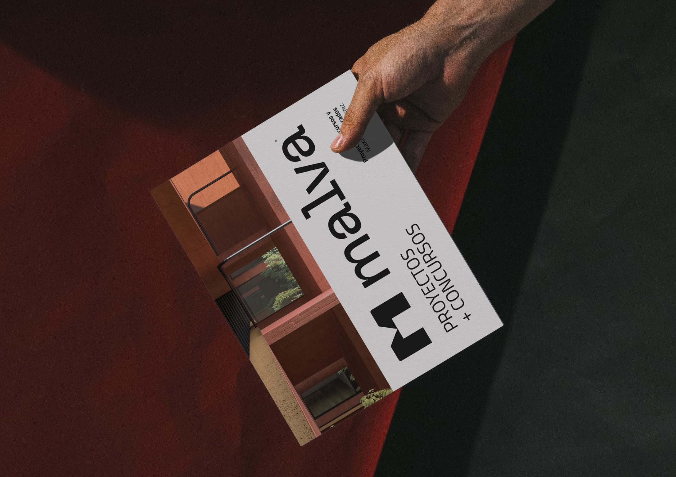
The branding is applied across editorial, institutional, and digital formats with a practical and consistent approach. In brochures and printed pieces, the system organizes content clearly, while in institutional applications, site signage, construction hoardings, and merchandise, the logo and isologo maintain visibility and coherence.
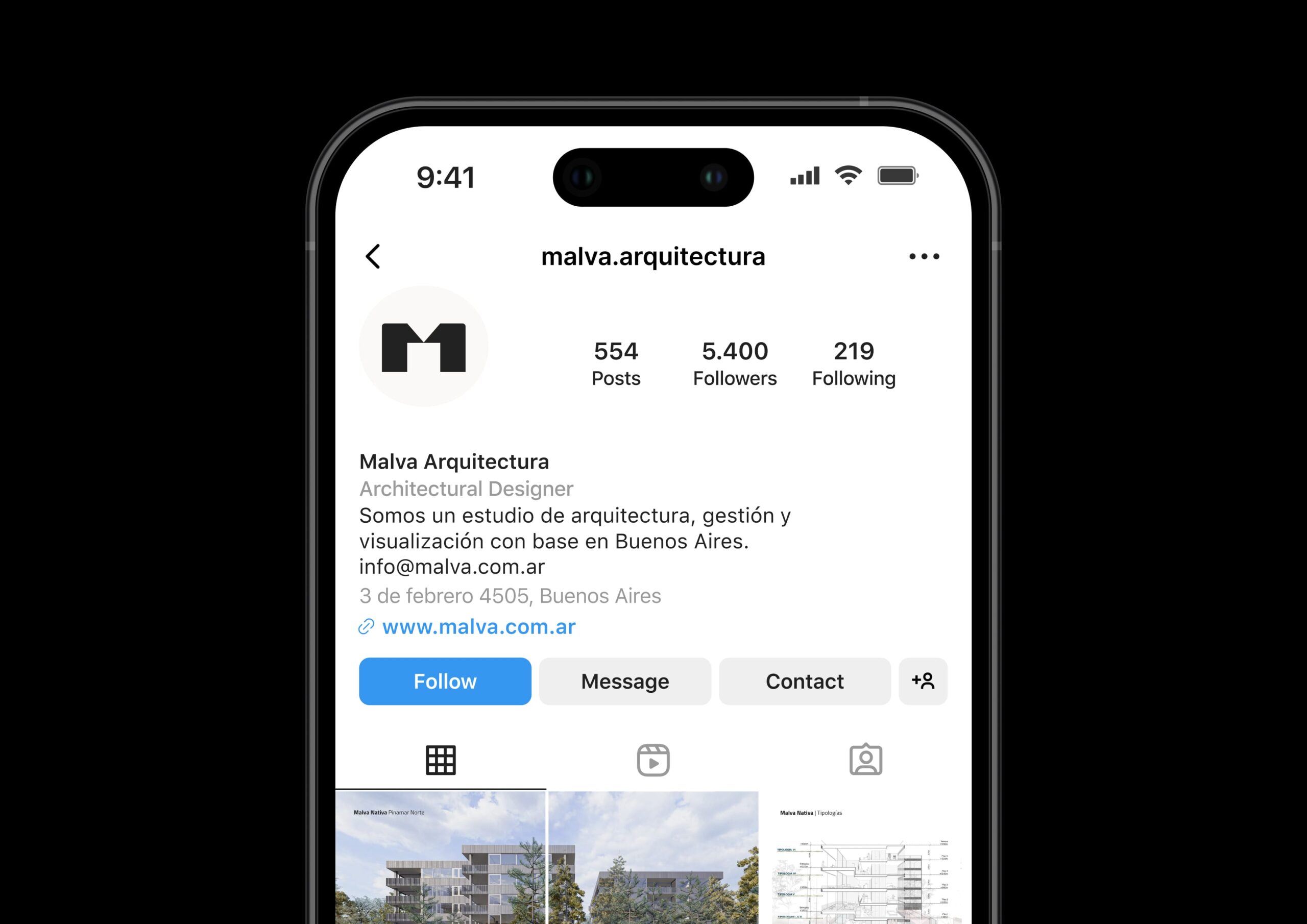
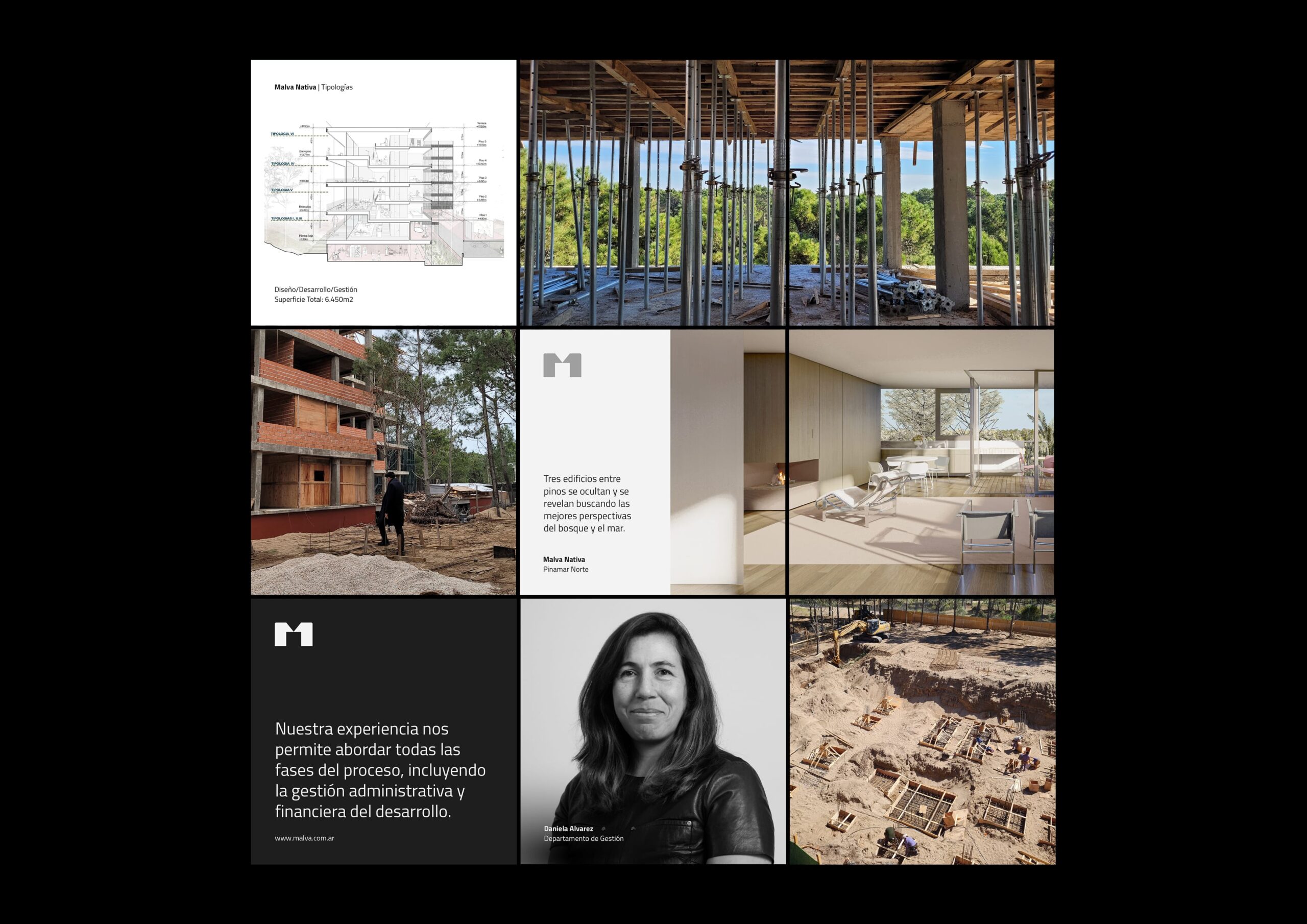
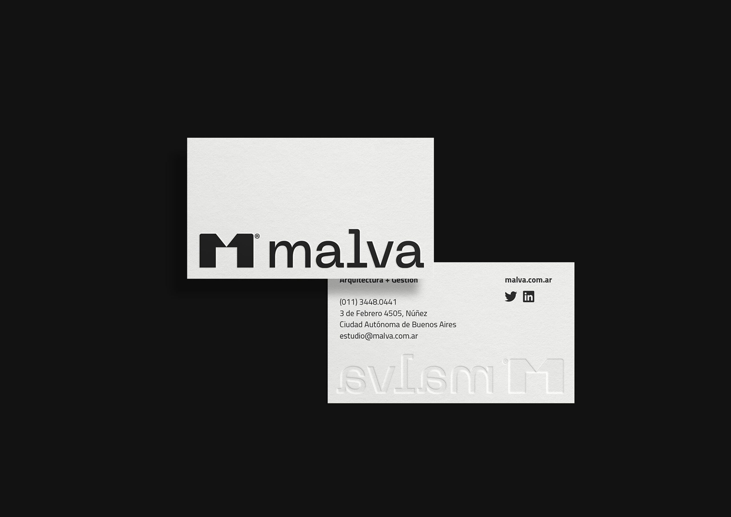
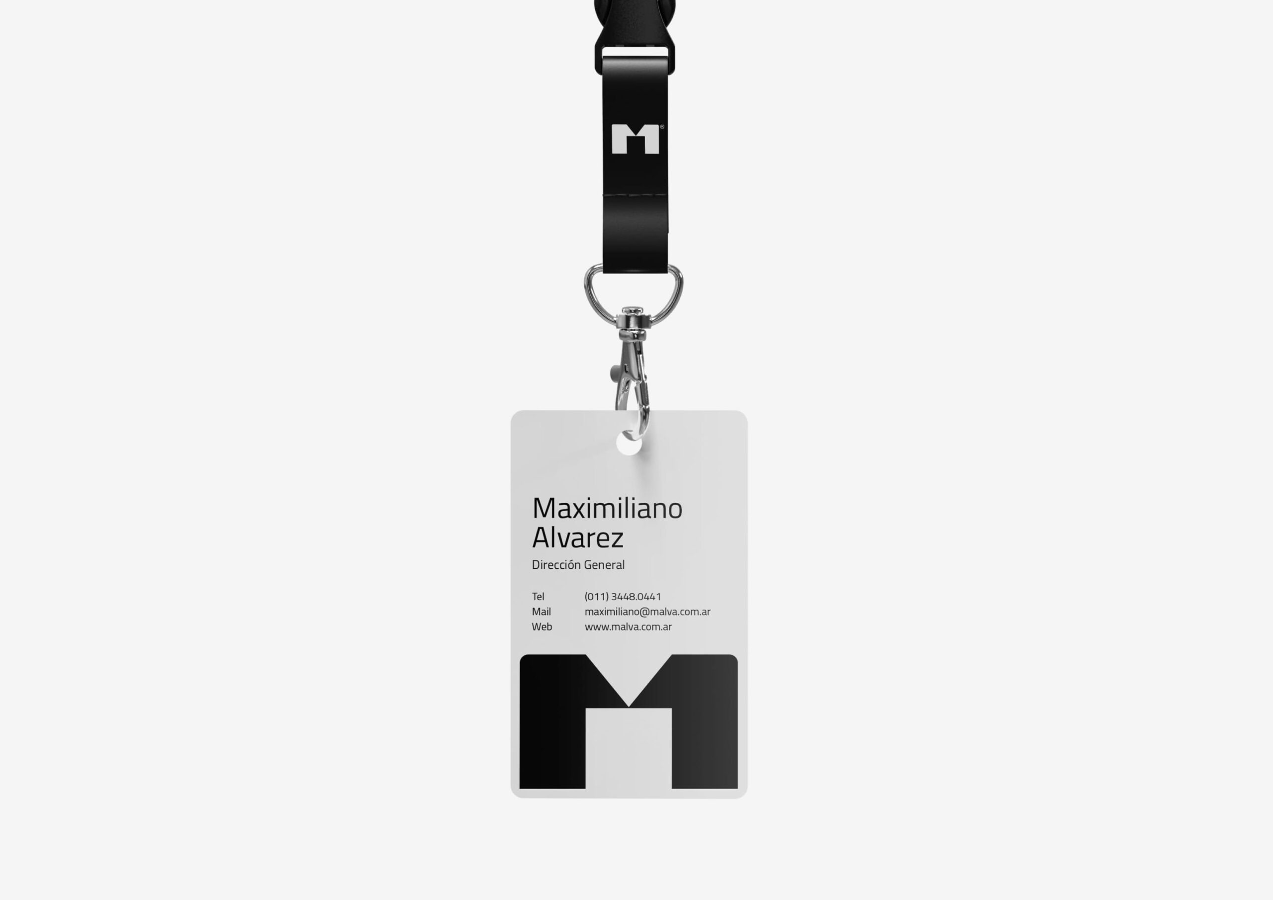
The mark works directly with architectural textures and materials, allowing it to integrate naturally into built environments. This extends to social media and everyday elements like business cards, where the identity remains clear and functional. Across these uses, the design translates the studio’s spirit into concrete applications, maintaining a consistent visual language in different contexts.
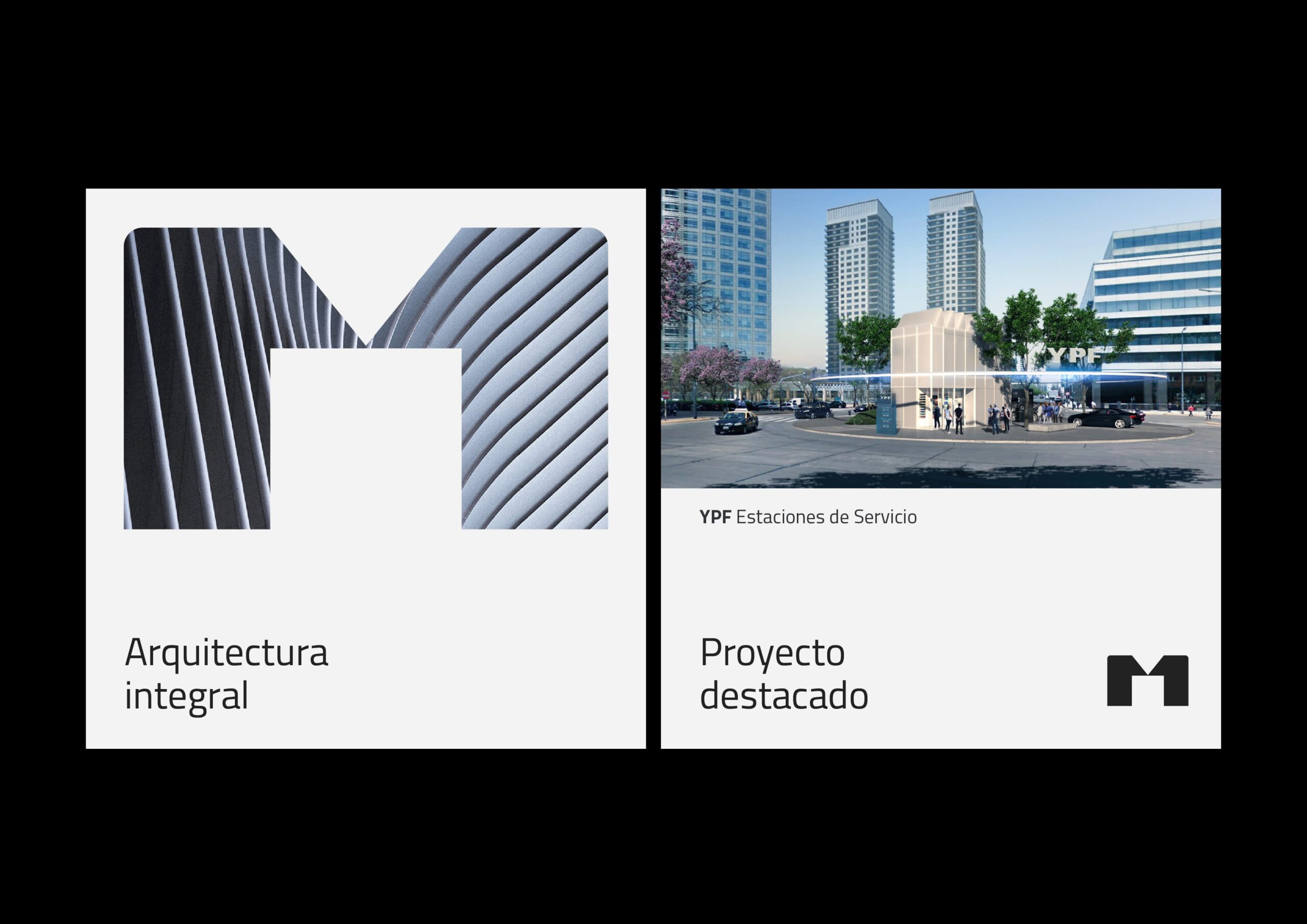
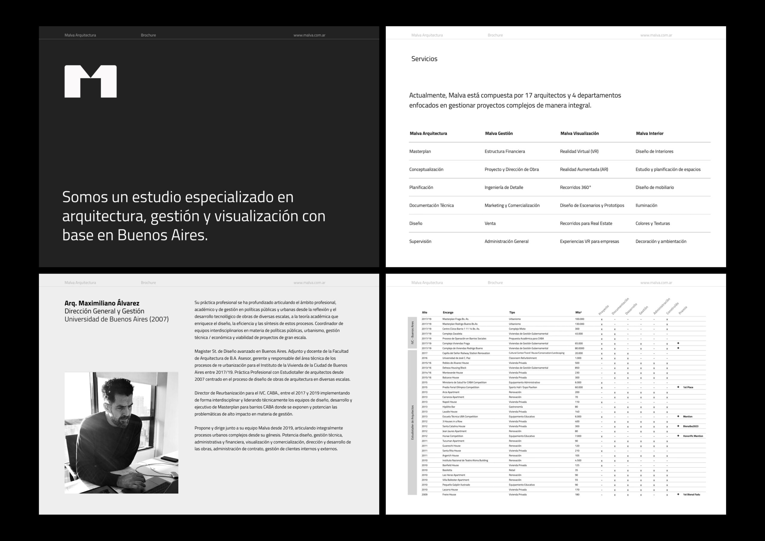
The editorial system was developed to present the studio’s work in a clear and structured way, balancing visual impact with precise information. Through a consistent grid, typographic hierarchy, and careful image selection, the brochures allow each project to be communicated with clarity while maintaining a cohesive identity across all pieces.
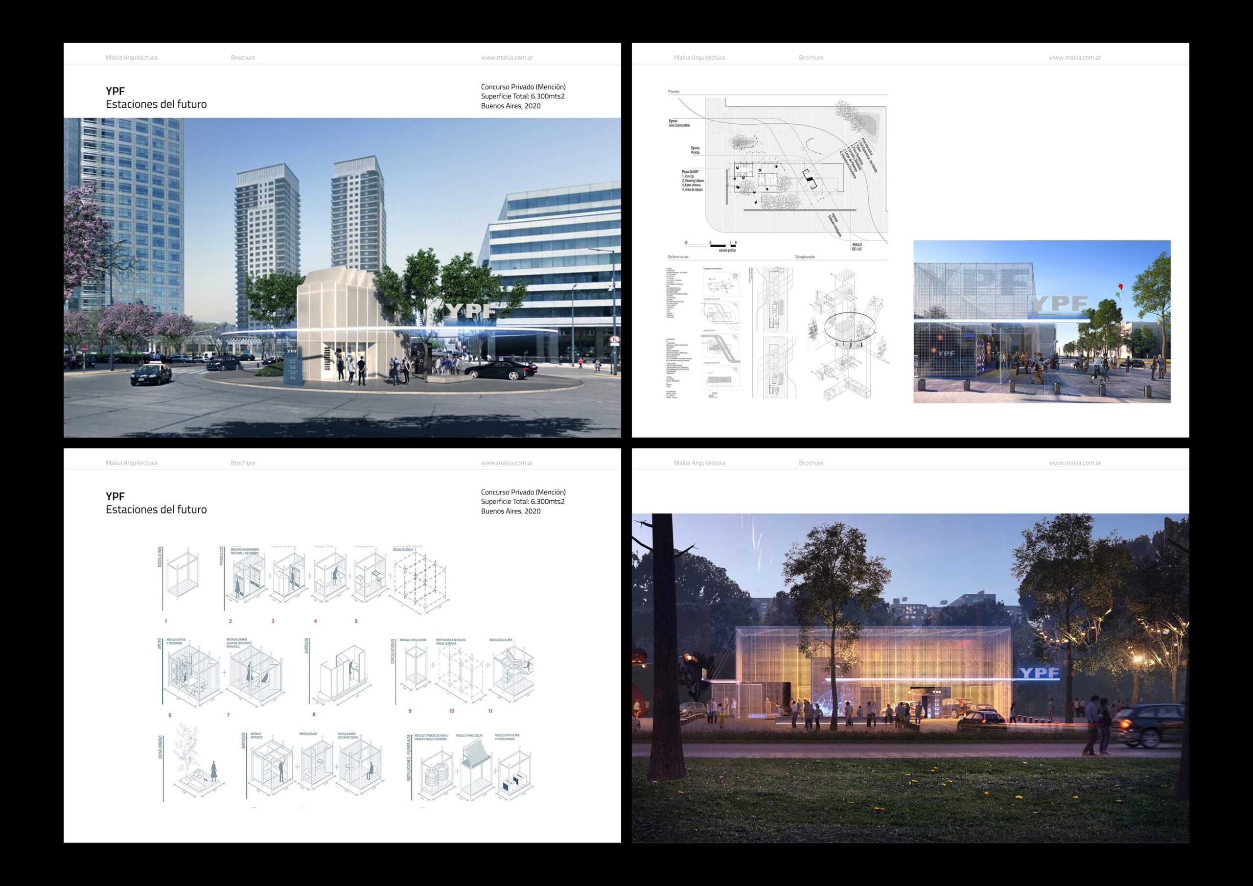
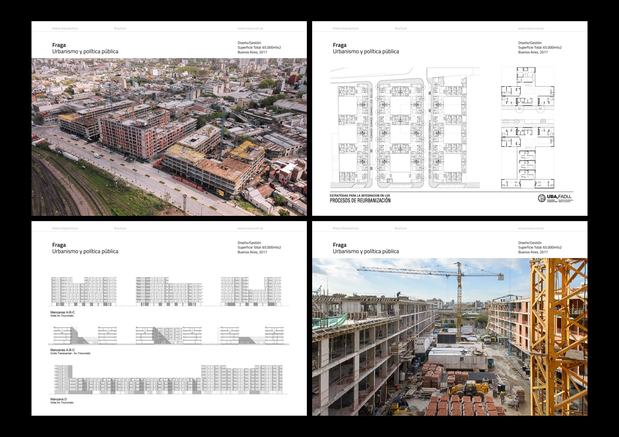
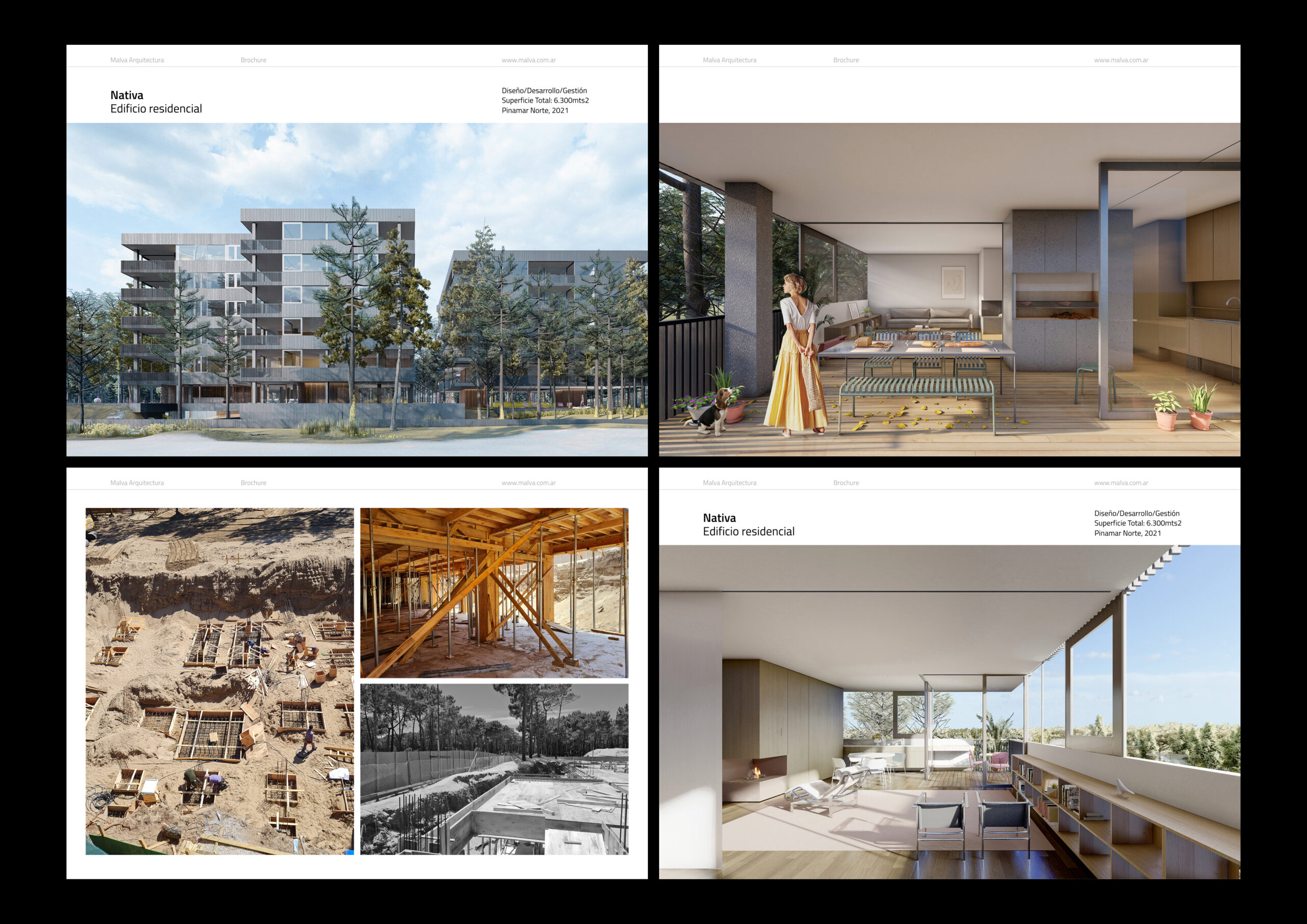
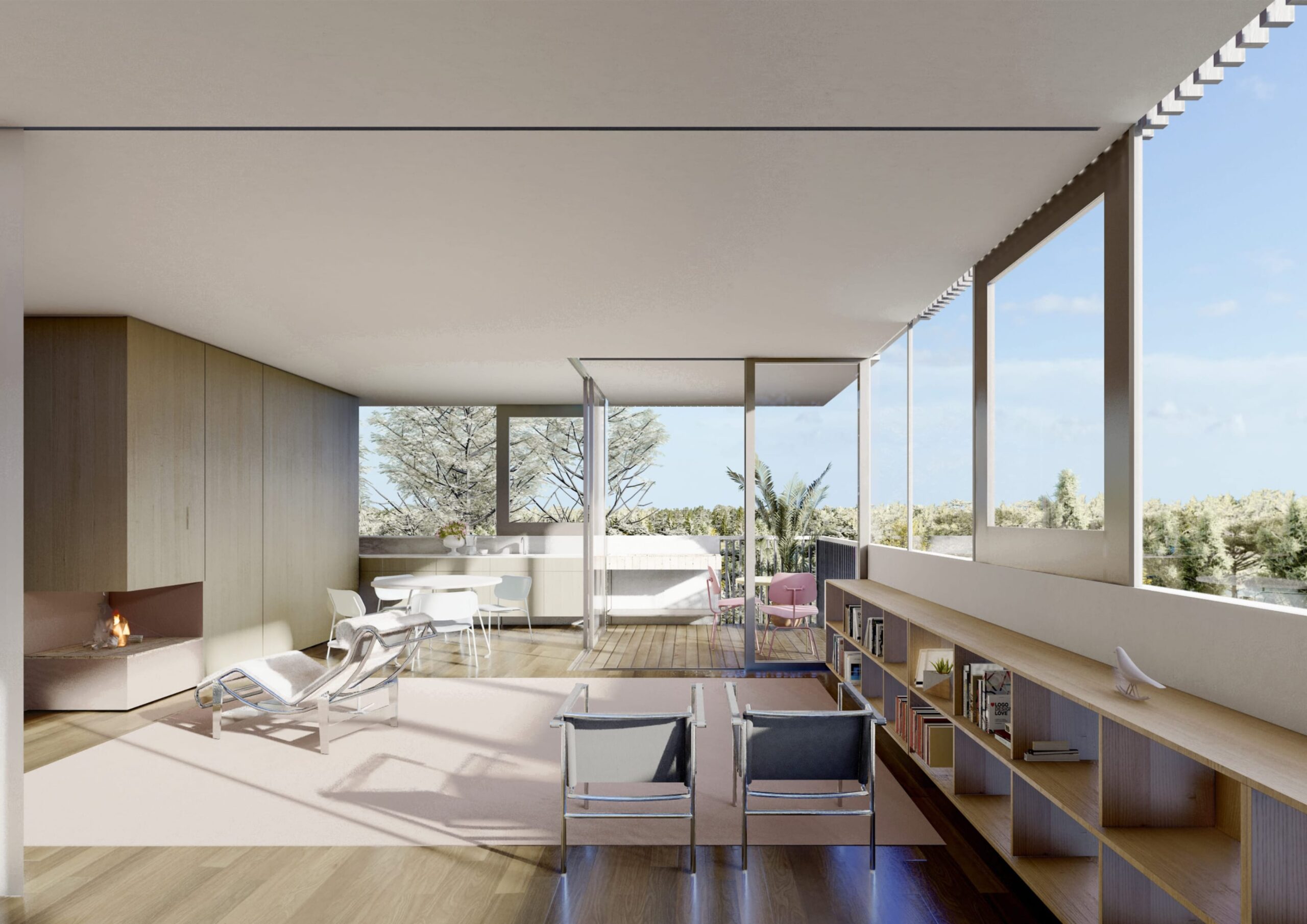
Within this framework, a selection of projects of varying scales is presented, ranging from small to large interventions. The work includes awarded and shortlisted competition entries, as well as public urban developments, renovations, residential buildings, hotels, and more. Each brochure adapts the system to the specific needs of the project, while preserving a unified visual language that reflects the studio’s approach.
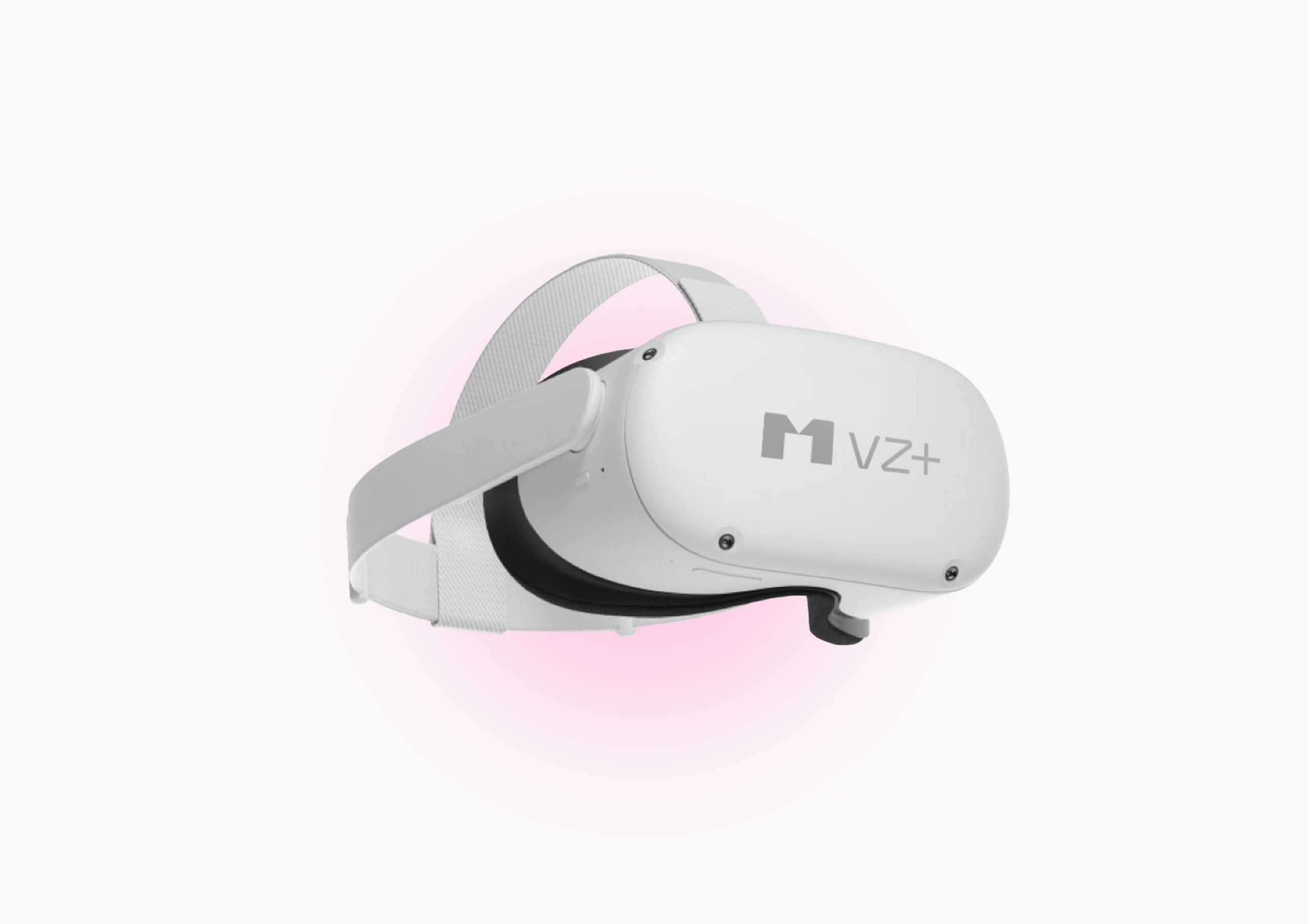
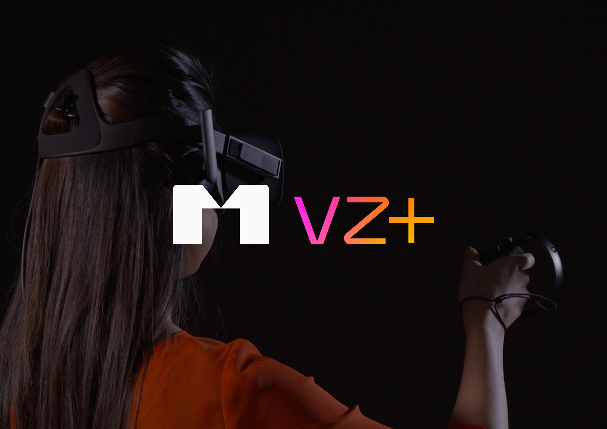
M VZ is a sub-brand of the studio focused on architectural visualization and immersive experiences. As a young and innovative practice, it incorporates renderings, animation, and virtual tools to communicate projects in a clear and engaging way, while maintaining a close and curated approach.
From a design perspective, the isologo was adapted for digital environments, ensuring clarity across screens and motion. A more vibrant color palette introduces a contemporary, technology-driven tone, while staying aligned with the core identity system.